How Packaging Colorways Play With Consumer's Minds
04 February 2020
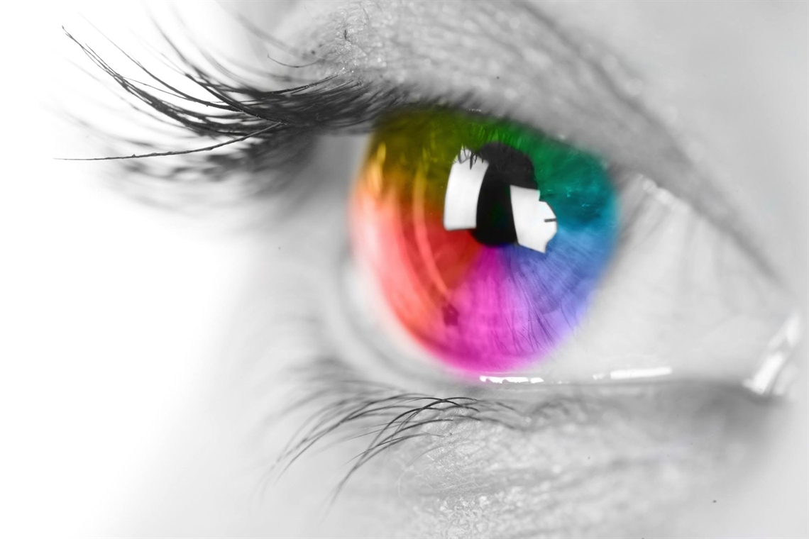
Colors are everywhere, and for thousands of years, humans have used the ever-broadening spectrum of colorways to express emotions and convey messages.
Back in ancient Egypt, artisans created blue with ground limestone, sand, and copper-containing materials like azurite or malachite for pottery or tomb decor. Ancient societies may have been limited in their ability to express through color, but today, we utilize every color available in creative mediums.
Over time, we've come to establish certain emotions and perceptions around colors. Artists, designers, and even marketers have learned how certain objectives can be met through the use of specific colors. Society has painted their own subjective brush over the entire spectrum of color, and there are some fairly obvious thoughts that are attached to individual colors.
Why Are Colors So Essential for Packaging Experts?
Color and psychology work in tandem to mirror human behavior and intent. Marketers and packaging creators know this and take every opportunity to take advantage of how a certain target audience may react to a specific colorway.
Sure, colors don't necessarily hypnotize a potential customer into making a purchase, but they do guide them toward a decision. Choosing the right colorway may not revolutionize your product, but the wrong colorway can certainly be damaging. Can you imagine if Apple chose orange or Mercedes-Benze chose purple? Colors can limit a brand's ability to reach a certain audience or even create marketing opportunities that don't look childish or too playful.
Colors create a pathway for potential customers to gain insight into what a brand is all about. They can be used to influence and change the ways a target audience thinks and digests information presented by a brand. Package designers are there to create a first or lasting impression — and colors play an important role in that process.
Here are some common colors used in packaging designs, and how you can use them to your advantage.
Black
When you think of companies that utilize a lot of black in their packaging, what do you see? It's a strong and powerful color that holds a lot of weight. It typically evokes control and power. Black can also be a classy color that you'll see a lot with luxury or boutique products.
It's also a great option to pair alongside another brand identity color. As we go down the list of potential packaging colorways, you'll begin to understand how to mix and match colors to establish the emotion and perception you're looking for.
White
Many brands employ packaging options to elicit simplicity. Too many colors make products or services seem complex, while a lack of diversity in a design does the opposite. When you think about brands that put seamless user experience and simplicity at the top of their objective totem pole, white is usually in the mix.
The iPhone might be the best example of this, where Apple made every effort during their product shift to simplify the complicated stigma of "smartphones" to the more casual consumer. Their packaging choice: An all-white box.
Green
This one is pretty simple, can you guess it? If you said nature or money — you're correct (albeit, it's an easy one). Today, eco-friendly company values are a trendy bandwagon, but that doesn't mean they aren't a strong ally for companies looking for customers that value the preservation of our natural world or a healthy alternative.
Organic, all-natural, or recyclable products often use green packaging as a way to express their product's contents. Even if it's not a brand color, it can still be the main ingredient in a packaging solution to get the point across about a particular product.
There's one more super important piece of the green puzzle to work out. Instructions or directions on packaging utilize green and red (which we'll get to next) to decipher right from wrong. Green is often associated with the correct or successful way. It has a strong connection with safety, while red is associated with danger or warning. There are many competing theories as to why this is. Some say it's because of fire and heat's dangerous state. Some say it's because red can be seen from further away.
Regardless, if your packaging has directions that need to differentiate between the correct and incorrect way of using a product, this is an important piece to take note of.
Red
Now, as we mentioned in the section above, red can be an attention grabber, something to really catch a consumer's eye. It's a color that has a lot of excitement and passion in it; it's full of energy. However, because it's such an electric color, it's used most often with products that you'd want to associate with excitement and passion. Be careful, though; it's a strong correlation with danger and caution — but that shouldn't deter your packaging if you want your product to stand out.
Yellow
When you think of sunshine and happiness, it's all about yellow. This is a color that makes people happy, optimistic, and warm. That being said, it's rarely used as the main colorway in packaging design. Too much yellow can actually be jarring and unsettling. It's a great piece to use on packaging for a sale or additional push to purchase (30% off or Free Shipping, for example).
Blue
Companies that want to convey a sense of trust and stability often look to blue in order to get the job done. Many tech companies use this color, most likely due to the sensitive data they may have from their customers. Facebook and Twitter are just two prime examples of technology conglomerates that use blue to convey trust and peace of mind with their users.
Also, many healthcare industries have blue on their packaging and logo designs — again, a sign of trustworthiness. The medical sector relies on trust with their patient pool to create lifelong customers and patrons.
Orange
Orange is strongly associated with creativity and enthusiasm. It's a bright and vibrant color, one that draws attention and makes itself seen and known. Too much orange can be a bit distracting, but it's great for a call to actions or emphasis on packaging designs.
Many construction companies, DIY type products, and even children's products use orange to represent the creative and adventurous spirit of their products.
Purple
People mostly associate purple with nobility, and it's a powerful color that is often linked to luxury. Too much purple may come off as overbearing and may make your customers feel inferior to your product.
Purple is best used in small doses and can be a great way to capture the big spenders. In color psychology, this color is best used with packaging as an accent and not the main colorway.
Your Packaging Colors
Your packaging says a lot about your product — and choosing the right colorway can make a big difference in how your brand is perceived. Here at The Packaging Lab, we work with clients in a wide variety of industries to provide a canvas for them to design premier packaging creations.